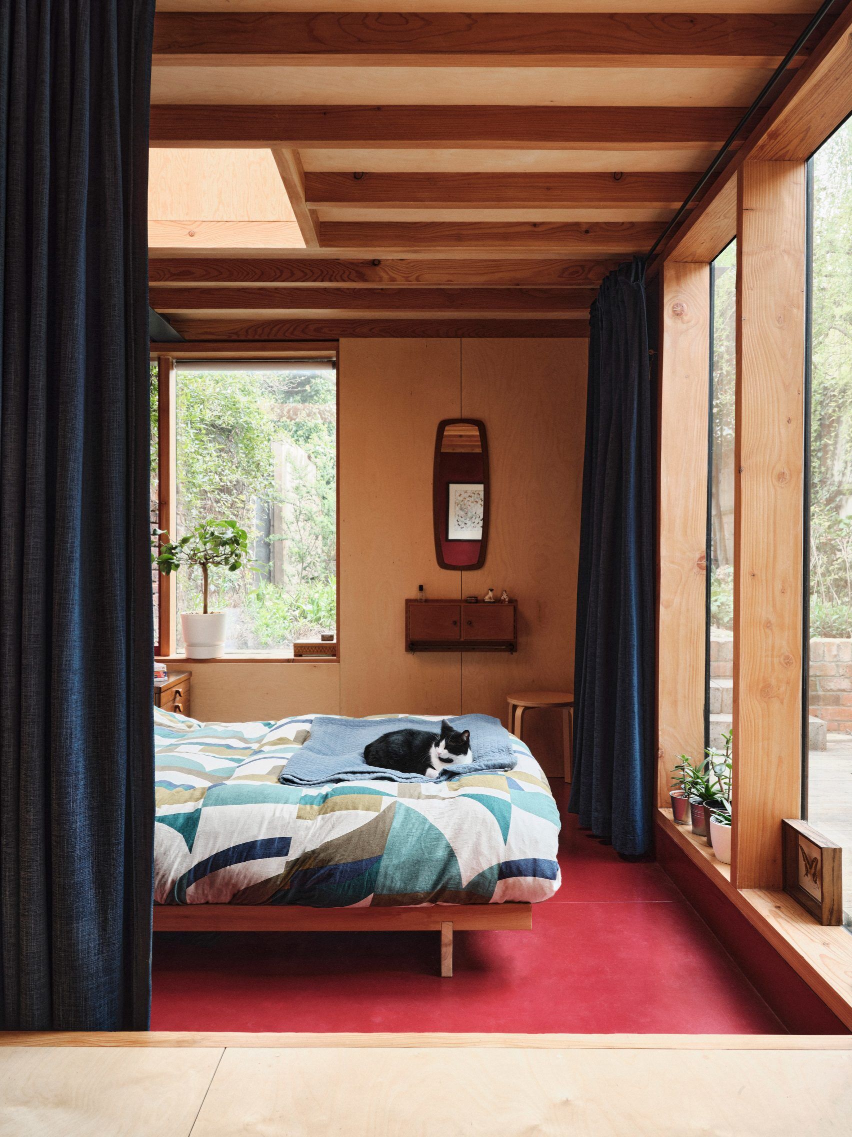
The holiday season is color-coded with familiar classics: white, blue, green, and most of all, red. This year, however, red has enjoyed a popularity that's made it much more than just a Christmas-time shade. As a matter of fact, it's become a go-to in the interior design world, the center of a TikTok phenomenon titled "unexpected theory."

First coined by Brooklyn-based interior designer Taylor
Migliazzo Simon, the theory argues that adding red to any room, in big form or
small, inherently elevates its design.
In her viral TikTok video, which has
over a million views, she shows how red works in unexpected spaces: a green
bathroom with red sinks, a mustard couch under a red lamp, and a bright red
frame against a rust-colored wall.
“I’m petitioning to make red a neutral
because it just looks good with everything,” she says.
Designers echo this sentiment, highlighting red's ability to bring energy and dynamism to a room. As Washington D.C. designer Annie Elliott puts it, “Red is timeless—it’s a safe accent that works with anything.” Designers have repeatedly outlined a few key principles for putting unexpected red theory into practice, providing solid, insider tips for those wanting to try it out themselves.
First, tiny is mighty. The color's bold energy is sure to leave an impact, so don't undersell the power that small splashes of red can have. an ideal demonstration is found in the "walled Garden" house in London, designed by Nimtim Architects, where a dining table with red legs stands out in an otherwise neurtral room. "It brings some nice vibration to the space," says designer Keith Carroll.

Second, clashing is smashing. Unexpected red theory
initially caught fire because of its element of surprise. So, experts say, add
red in unpredictable places, alongside unpredictable colors. “’There’s nothing
worse than a homogenous and boring space…avoid any matchy-matchy hellscape,’”
says Charleston-based designer Jacob Laws. One example can be found in
Budapest’s W Hotel, designed by studios Bowler James Brindley and Bánáti +
Hartvig. The two fiery pieces, though simple, are enough to inject excitement into
a room that might have otherwise felt pallid.
Last, go for bold on bold. Red comes alive when paired with other saturated shades, conjuring vivid, sensorial environments. Integrating red with deep purple, for example, comes highly recommended by many, including Migliazzo Simon herself. New Orleans’s Hotel Saint Vincent, created by Lambert McGuire Design, showcases the decadent color combination perfectly. “Trikoupi Apartment” in Greece, designed by Point Supreme Architects, features a kitchen with stained-green plywood storage walls and a center island topped in bright red Corian. The resulting aesthetic is simultaneously vibrant and refreshing.


