Sanctuary: Where Color Meets Comfort
For the second year, we introduce an exclusive Pantone Color of the Year palette that encourages you to reimagine design. Taking its cue from soothing Peach Fuzz, we present Sanctuary, an invitation to create havens of comfort and togetherness.
A Warm and Grounded Palette
In a world filled with uncertainty, we're seeking refuge and striving for more meaningful, intentional lives centered on positive connections. As we reevaluate what success and purpose mean to us, we're embracing a slower, reflective approach that's leaving its mark on the ever-changing landscape of design and color.
Sanctuary is a carefully curated collection of colors and materials that exude a sense of protection and tranquility. Imagine stepping into a space adorned with restorative hues that envelop you in a soothing embrace - Where every shade and texture beckons you to unwind and reconnect.
Concept Pro Peachy Keen
Brisa Ice Pink
Promessa Merlot
Concept Pro Apricot Ice
Ultraleather Citronella
Montage Chimera
Ultraleather Champagne
Incorporating Sanctuary creates lasting, comforting, and inspiring environments with personality. Discover the colors and materials of the palette and transform your next project.
Click here to request your Sanctuary brochure & ring set today.
The colors have unassuming energies that creates harmonious connections to each other and the surrounding environment. The resulting aesthetic is subtle yet sophisticated, perfect for spaces that demands calm and quiet.
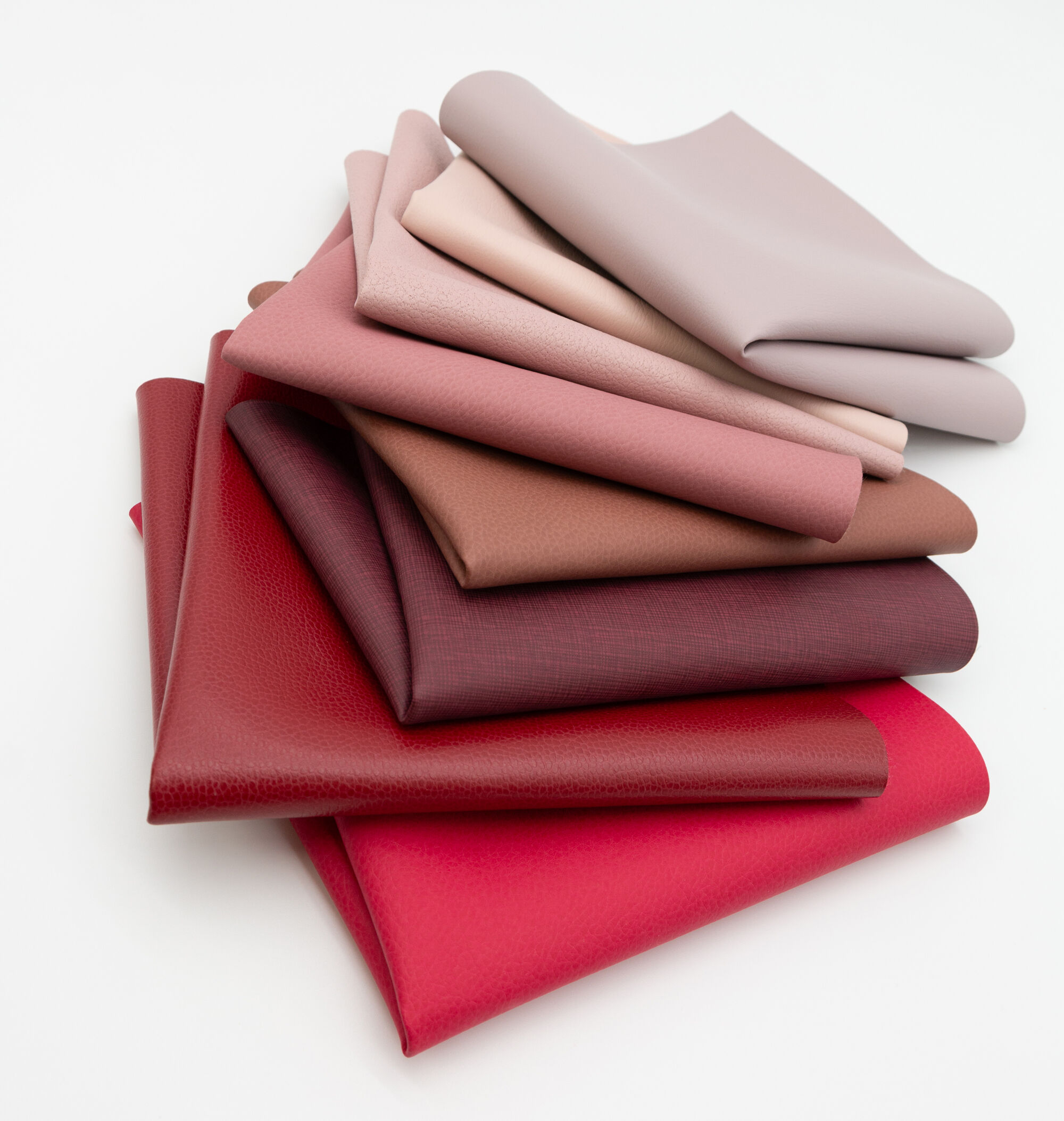
When paired with Vivid Punch, or separated into smaller stories, each shade shifts to become a bolder, more vivacious version - making it perfect for spaces that crave a punchier moment.
Whether you decide to use the full palette, or combinations within it, Synergy offers you flexibility to create a tranquil, soothing environment or a more dynamic or energetic space by adding touches on Vivid Punch.
We see the colors in this palette being used in a variety of spaces including hotel lobbies, student lounges, waiting rooms and even workspaces. The shades harmonize well with natural materials like wood, metal, marble, or glass.
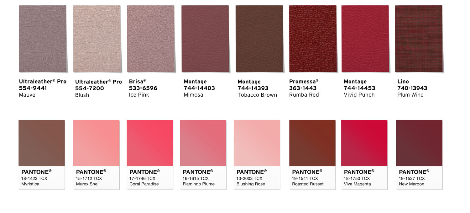
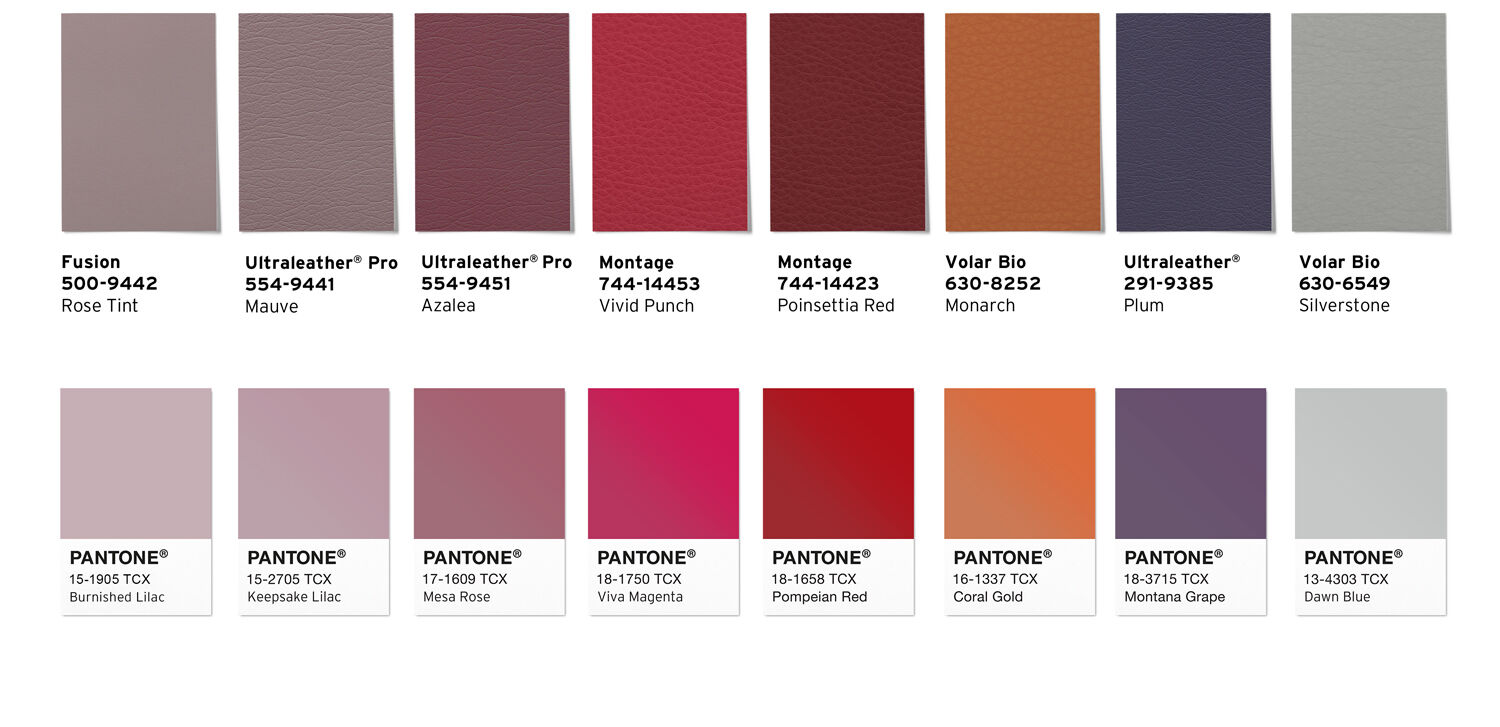
Balance Vivid Punch + Silverstone
Tranquility Vivid Punch + RoseTint
Harmony Vivid Punch + Mauve
Integrity Vivid Punch + Plum
Unity Vivid Punch + Azalea
Solidarity Vivid Punch + Monarch
Stability Vivid Punch + Poinsettia Red
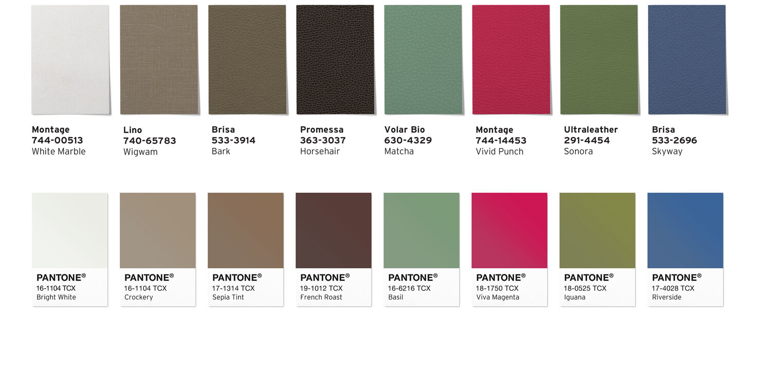
Our exclusive palette represents the elements of nature and is designed to encourage the use of color to energize or transform any interior space. Awakening celebrates the vibrancy of 2023 Color of the Year Viva Magenta by grounding it with warm natural shades. These are hues that can be easily applied to any market or setting, especially in combination with our new Color of the Year inspired shade Vivid Punch in the Montage collection.
Through materiality and supported by our renowned comfort and performance attributes we create an opportunity for designers to tap into the spirit of Viva Magenta, whether through the full palette or combinations within it.
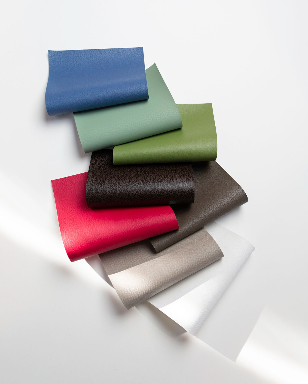
Montage 744-00513 White Marble
Lino 740-65783 Wigwam
Brisa 533-3914 Bark
Promessa 363-3037 Horsehair
Volar Bio 630-4329 Matcha
Montage 744-14453 Vivid Punch *New!*
Ultraleather 291-4454 Sonora
Brisa 533-2696 Skyway