Celebrating Pantone's Color of the Year, Peach Fuzz, we've curated an exclusive color palette inspired by the shade’s inviting softness.
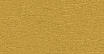
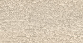
Sanctuary combines cozy pinks, sweet peaches, earthy browns, and calming neutrals to create a restorative ambiance.
Recognizing the desire for nurturing amidst life's turmoil, Pantone chose Peach Fuzz for its tenderness and warmth, acknowledging the need for respite that many of us share. As Pantone color specialist Leatrice Eisman shared, "We're going through a lot of turmoil in our lives, and we have a need for a color that’s nurturing."
Sanctuary channels comfort, curated for spaces designed to serve as havens from the outside world. The palette is versatile and suitable for a range of environments, ranging from residential to dining establishments to professional workspaces.
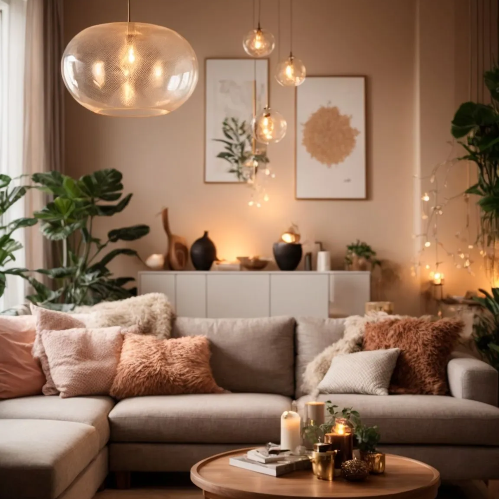
In interior design, Sanctuary creates warmth and connection, with cream-colored furniture complemented by chocolate and blush accents.
Windermere Real Estate suggests adding peach hues through the use of glowing light: place candles in orange candlestick holders or tea candles in peach-colored hurricanes to bathe the space in golden-hour incandescence.
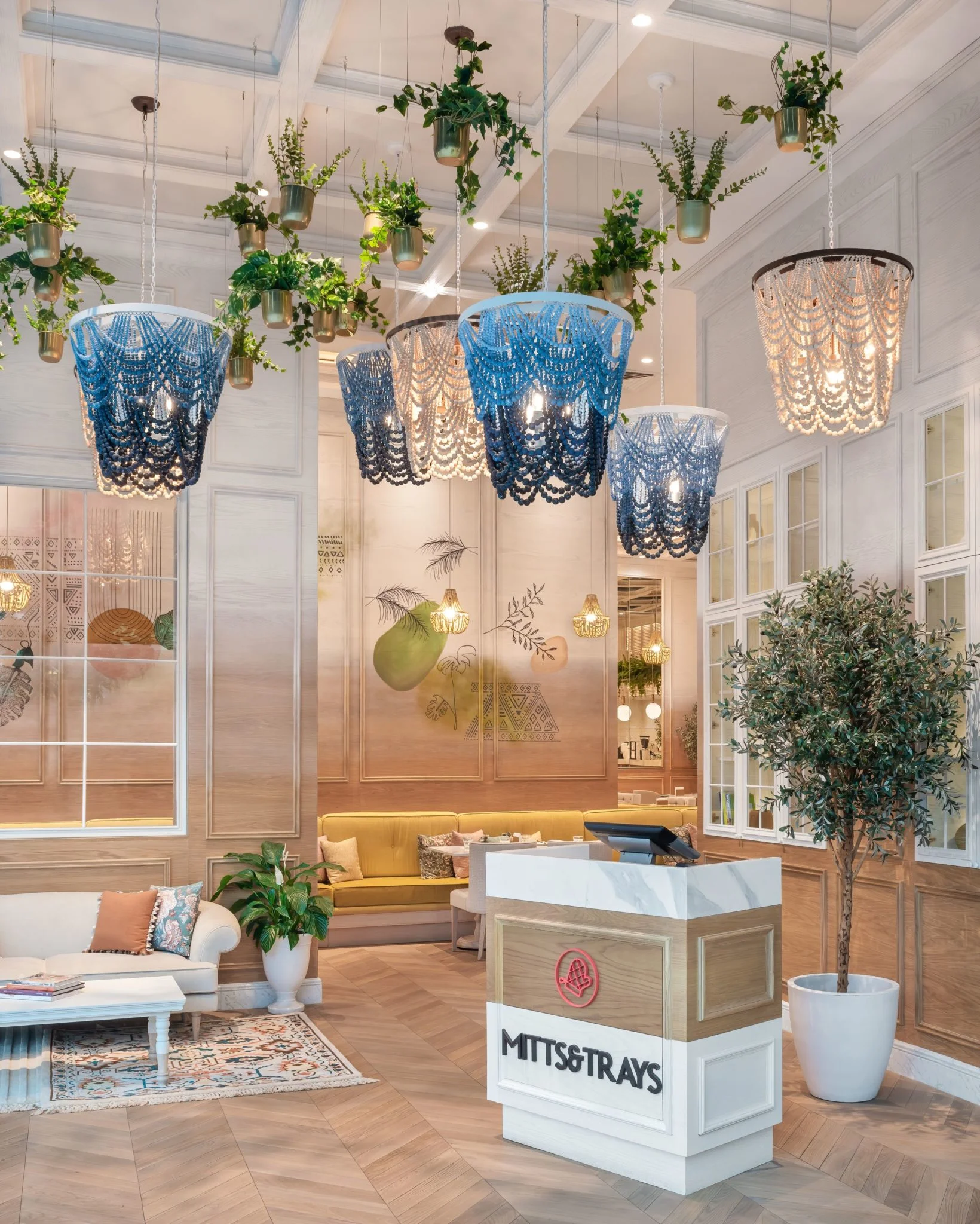
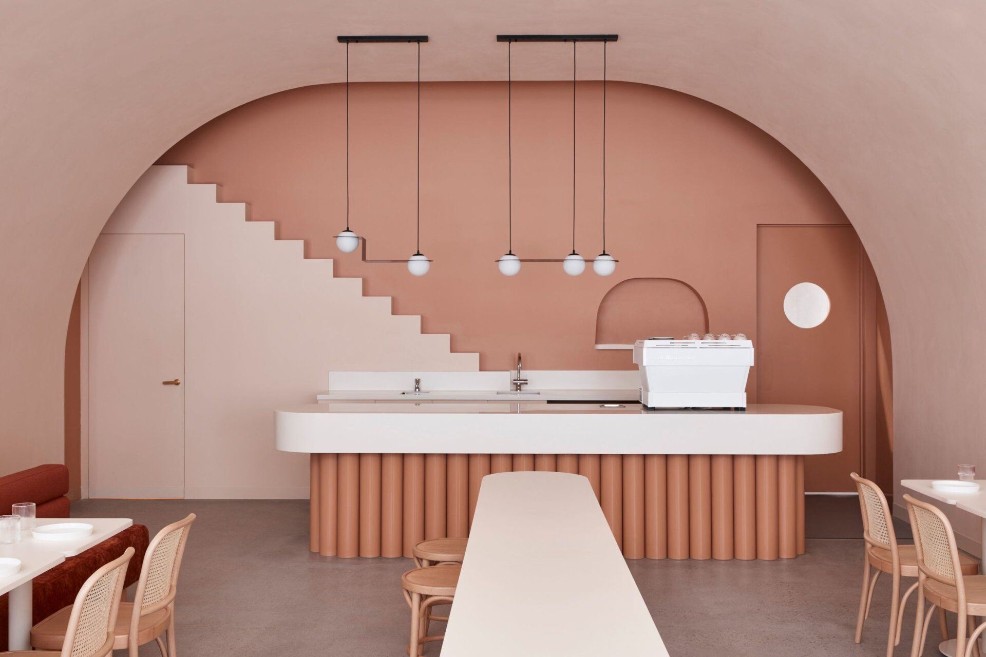
Eateries worldwide embrace the comforting hues of Sanctuary, from Dubai's Mitts & Trays café with its whimsical peach and cream walls to Melbourne's Budapest Café, boasting a gentle, refined ambiance with earthy peach tones.
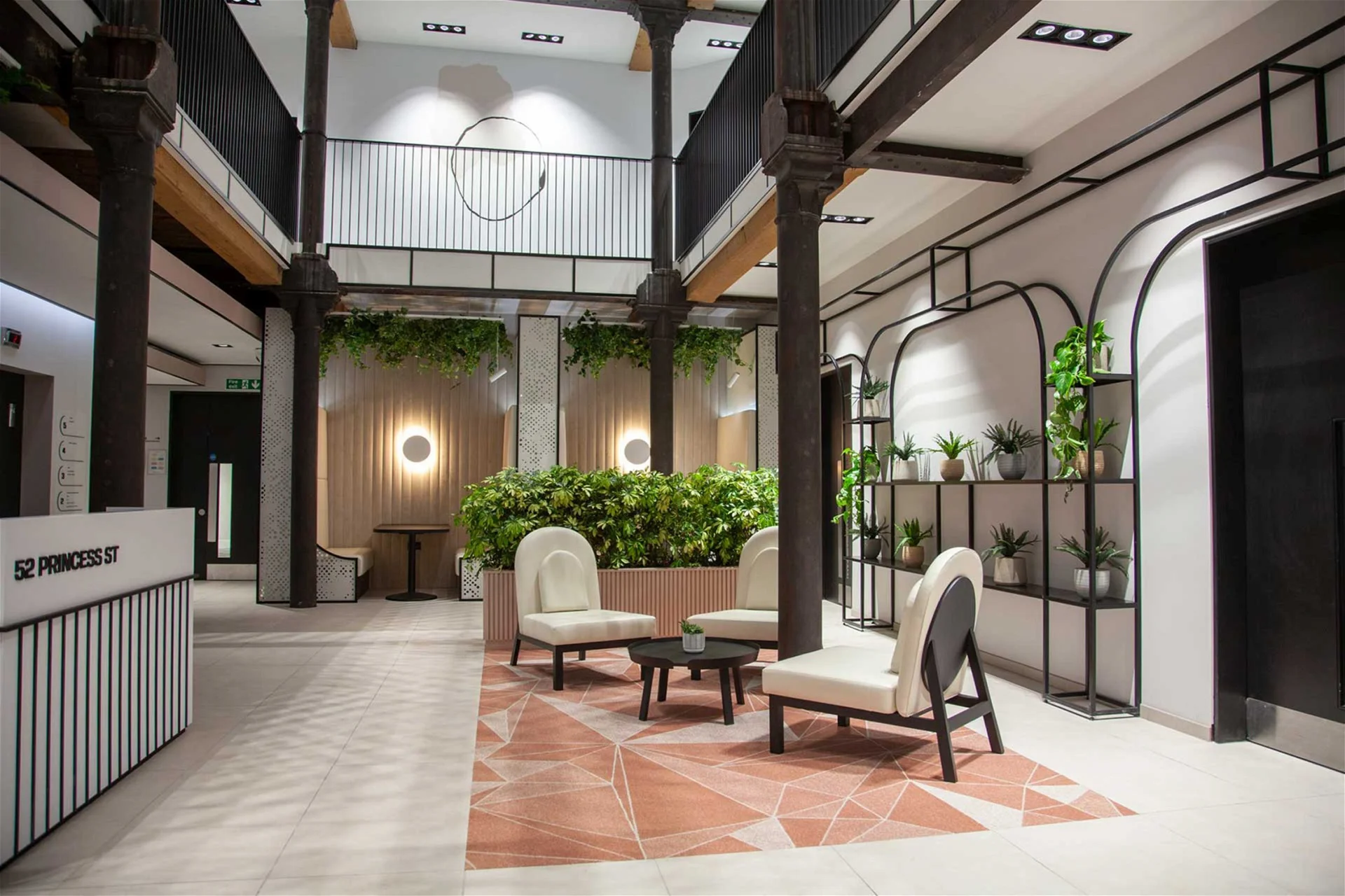
In office spaces, Sanctuary's shades cultivate an atmosphere that feels uniquely welcoming.
Workplaces are meant to be places of unity, where teams can come together to brainstorm and collaborate. Common color palettes, which traditionally include neutrals and whites, can feel cold.
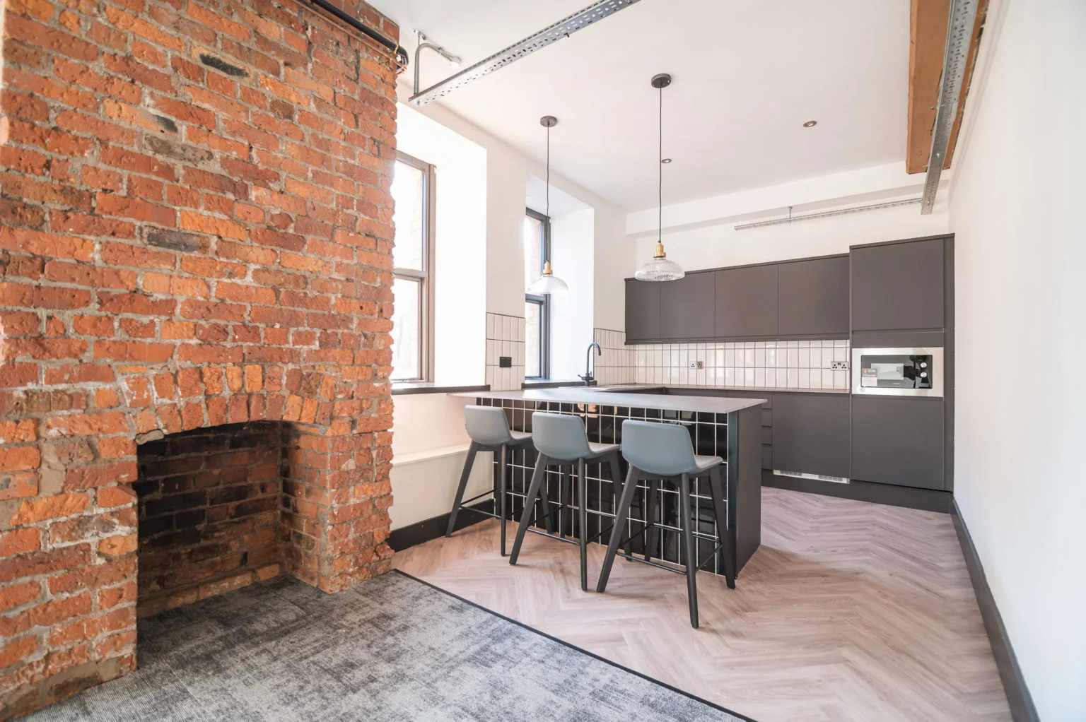
Adding touches of warmer shades, like peach, brown, and copper, goes a long way toward giving office spaces an encouraging, more open feel—a principle that a workplace setting in Manchester, UK, demonstrates beautifully.
52 Princess Street Offices’ reception area places a peach-hued rug over its white floor, while incorporating earthy browns through exposed wood beams and tabletops. In the workspaces themselves, brick walls introduce rust and bronze hues to offset cooler shades of white and taupe. The overall tone is one of warmth and cohesion, perfect for fostering togetherness.
To complement these sustainable designs, we've curated a collection of our favorite nature-inspired shades, celebrating the inherent beauty of sustainability.
