One way of exploring our emotions, thoughts, and personally traits is through an aura reading. You may be aware of this practice, as it has become increasingly popular in the world of wellness. A more unfamiliar concept, however, is utilizing aura readings in the design process.
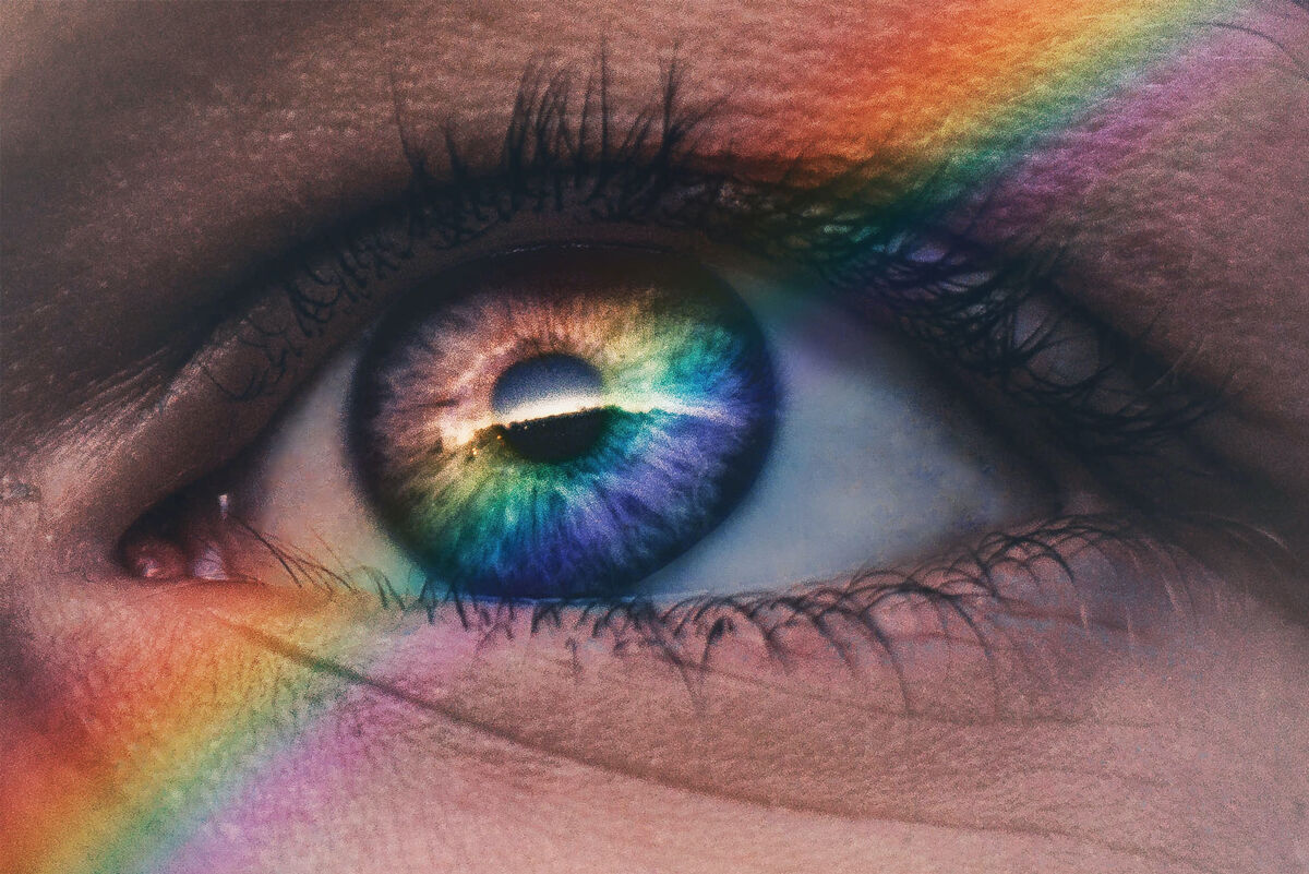
Aura readings allow for deeper introspective insight. An aura is an electromagnetic field that surrounds the body, the frequency of which translates into a specific color. Liberty Apolinario, an aura reader at House of Intuition, describes it as a “mirror to reflect and radiate the energy that a person holds.”

Each color represents a distinct temperament.
Red represents confidence and ambition; these people will always rise to meet a challenge.
Orange signifies sociability, independence, and creativity; making friends is never a problem.
Yellow means you’re an optimistic and free-spirited individual; you’re probably bursting with vitality and quick to start a conversation.
Blue symbolizes intuitiveness, empathy, and sensitivity; these people likely place high value on their personal relationships.
Purple suggests gentleness, wisdom, and peace; these people are usually calm and feel their life’s purpose is to make the world a better place.
Magenta indicates creativity and independence; they are steadfast in their pursuits and do not waver based on others’ opinions.
Green denotes compassion and healing; healthcare professionals, teachers, and parents often show green in their auras.
Pink conveys kindness and peace; it’s probably rare that this person ever finds themself in a fight.
Readers remind us that our auras are not stagnant. As our energy shifts, so too do the colors we emanate. Hues change with state of mind, daily stressors, and status of physical health; they evolve with the natural eb and flow of life. Some people even choose to attend annual readings as a method of tracking personal growth.
As readings often reveal the obstacles holding us back, readers might offer suggestions for constructive change. Aura consultant, Rachel Terry, for example, advises purple auras (who can be introverted and caring) to respect their own boundaries. More commonly, readers prescribe energy cleansers like mixing an “Aura Cleansing Spray” from distilled water, essential oils, and Epsom salt. Other remedies include meditation, sun-bathing, sage, and sound therapy.

Taking aura reading to the next level, we introduce Experience Hue, an exploration of self and design through color. How does our aura impact our work as creators? How can we harness this energy to create something special that reflects our true selves?
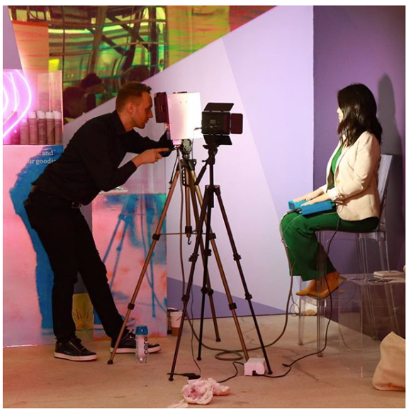
We follow the aura discovery journey of artists and designers We will uncover how their energies align with their design approach and see how they manifest their auras into a physical piece of work. Together we will discover more about ourselves and the design process through the power of personal connection.
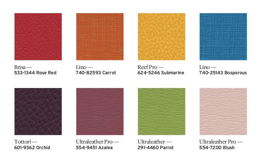
In the meantime, we invite you to explore our curated aura hues below/right to get started:
Orange – 740-82593 Lino Carrot
Yellow – 624-5246 Reef Pro Submarine
Blue – 740-25143 Lino Bosporus
Purple – 601-9362 Tottori Orchid
Magenta – 554-9451 Ultraleather Pro Azalea
Green – 291-4460 Ultraleather Parrot
Pink – 554-7200 Ultraleather Pro Blush
Please join us on Instagram and LinkedIn as we document this journey, starting with online magazine Sight Unseen. We will also invite you to join along as well, so be sure to follow us so you don't miss out.


